The Facts of Obama’s Presidency are Quite Different from the Spin in His Farewell Address
The claims in President Obama's recent cover letter and farewell address are based on a series of artful statistics that do more to mislead than inform.
In the closing weeks of his presidency, Barack Obama instructed the members of his cabinet to “prepare a detailed report on the progress we’ve made” since he became president. He then summarized these reports in a cover letter that paints a bleak picture of the U.S. before he entered the Oval Office and suggests that the nation turned around during his tenure.
Obama then repeated many points from this letter in his January 10th farewell address to the nation, where he declared that “by almost every measure, America is a better, stronger place than it was when we started.”
However, the claims in his letter and farewell address are based on a series of artful statistics that do more to mislead than inform.
For example, Obama contends that “on January 20, 2009,” when “I stood before you and swore a sacred oath” to “meet the challenges we faced,” the economy was “shrinking at more than eight percent,” but now “eight years later” it is “growing at more than three percent.”
Looking at the full picture, the economy has experienced historically weak growth under Obama.
In reality, that –8% figure is a quarterly annualized rate from April–June of 2009, and the +3% figure is from July–September of 2016. Quarterly GDP figures are often erratic, and this makes it easy to cherry pick in order to serve a narrative, as shown in the graph below:

Looking at the full picture, the economy has experienced historically weak growth under Obama. Even after the recession ended in 2009, average real GDP growth has been 35% below the average from 1960–2009, a period that includes eight recessions. Annual GDP data, which removes the noise from quarterly fluctuations, shows substandard growth over the entirety of Obama’s presidency:
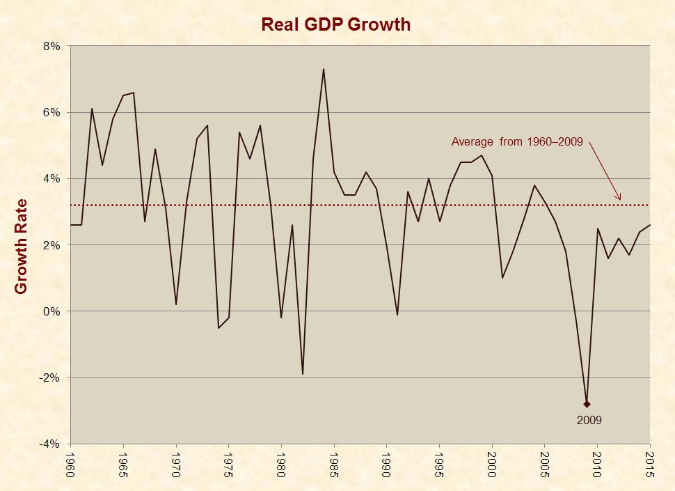
Such poor growth is odd given that the U.S. economy typically performs well in the wake of recessions, and the deeper the recession, the stronger the growth. In fact, renowned liberal economist Paul Krugman once argued that “the economic expansion under President Reagan did not validate his economic doctrine,” because “rapid growth is normal when an economy is bouncing back from a deep slump.”
The recession ended in the U.S. in June 2009, well before the vast majority of his “stimulus” bill took effect.
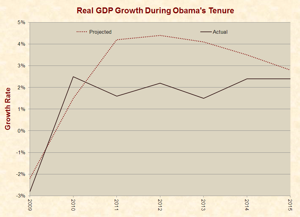
In early 2011, the White House Office of Management & Budget projected that real GDP would grow by an average of 3.6% per year for five years after the Great Recession (see pages 14–16). Obama’s economists noted that this figure was lower than the typical post-recession growth rate of 4.2%, but they concluded that the “lingering effects from the credit crisis may limit the pace of the recovery,” even though the recession left “enormous room for growth in 2011.” Ultimately, GDP grew by an average of 2.2%, or 39% below the White House’s conservative estimate.
Likewise, two weeks before Obama took office, the Congressional Budget Office (CBO) projected real GDP growth rates for upcoming years “under an assumption that current laws and policies regarding federal spending and taxation remain the same.” This graph shows CBO’s projections and what actually occurred:
In 2016, Obama took credit for “saving the world economy from a Great Depression,” but the recession ended in the U.S. in June 2009, or five months after he took office and well before the vast majority of his “stimulus” bill took effect (see page 2).
Along with economic growth, Obama’s missive provides other creative looks at his presidency, including this chart of high school graduation rates that is scaled to exaggerate the improvement:

America Under Obama
The upcoming 16 graphs present federal government data on certain key measures of America’s well-being during Obama’s presidency. The following features and caveats apply to these graphs/datasets and those above:
- To provide context and reveal trends, the graphs present all available full years of data back to 1960 or as far back in time as the datasets extend. All graphs are scaled from a baseline of zero or any negative figures.
- As explained in The Secrets of Economic Indicators, a textbook published by the Wharton School and Pearson Education, “The first release of many economic indicators contains pieces of data that are far from reliable and thus considered preliminary.” Hence, some of the more recent data may change over time.
- The graphs contain data on big picture outcomes with tangible impacts. Obama’s cover letter mentions variables like the portion of people with health insurance, but this is of little import if the insurance does not provide access to good medical care.
- None of the parameters graphed in these charts are an end-all, and each sheds limited light on very complex issues.
- A marker is placed on each graph in the year 2009, which was Obama’s first year in office. This provides a one-year buffer for Obama’s policies to begin taking effect, although some took longer and some shorter.
- CBO’s January 2009 projections are provided when applicable, and averages are provided when the data tends to oscillate over time.
It is also important to note that presidents cannot reasonably take credit or blame for everything that occurs during their tenures. Due to the limits of political power and the U.S. constitutional system of checks and balances, each president’s hands are tied to varying degrees by Congress, the courts, preexisting laws, state and local governments, economic cycles, demographic trends, terrorist attacks, natural disasters, and the actions of U.S. citizens and foreign governments.
President Obama and the Democratic Party possessed more legislative power in 2009–2010 than any caucus in recent history.
On the other hand, U.S. presidents have vast executive powers, and President Obama and the Democratic Party possessed more legislative power in 2009–2010 than any caucus in recent history. During this period, Obama enjoyed a 79-seat Democratic majority in the House and an effective 18- to 20-seat majority in the Senate. Obama’s House majority was greater than that of any president since Bill Clinton in 1993–1994, and Obama’s Senate majority was greater than that of any president since Jimmy Carter in 1977–1980.
After Republicans gained control of the House in 2011 and the Senate in 2015, they sometimes prevented Obama from having his way, but they generally failed to undo what he previously passed, stop Obama’s executive actions, or pass any laws without his consent. Over the past eight years, Obama has vetoed 12 bills, and Congress has overridden only one of these vetoes.
Median Household Income
Between 2009 and 2013 (latest available data), real median household income rose from $78,200 to $79,000. During the same period, real median household income after federal taxes declined from $69,800 to $69,200:

Between 2009 and 2015, real household cash income (which excludes “certain money receipts such as capital gains” and “the value of noncash benefits” like “food stamps, health benefits, subsidized housing” and “full or partial payments by business for retirement programs”) rose from $54,988 to $56,516.

National Debt
Between 2009 and 2015 the national debt rose from 85% of the U.S. economy to 105%:

Unemployment
Between 2009 and 2016, the unemployment rate dropped from 9.3% to 4.9%. During each of these years, the unemployment rate was higher than the Congressional Budget Office projected two weeks before Obama took office:

Labor Participation
Between 2009 and 2016, the civilian labor force participation rate for people aged 16 years and over declined from 65.4% to 62.8%:

Work Hours
Between 2009 and 2015, the average annual hours worked per U.S. resident increased from 724 to 757:

Productivity
In the words of Federal Reserve Chair Janet Yellen, “the most important factor determining living standards is productivity growth.” From 2010–2015, average annual productivity growth was 0.7%, as compared to 2.2% from 1960–2009:

Federal Taxes and Spending
Between 2009 and 2015, federal spending decreased from 25.9% of the U.S. economy to 22.5%. During the same period federal revenues increased from 15.7% to 19.3%:

Composition of Federal Spending
Between 2009 and 2015, the portion of federal spending devoted to social programs increased from 61% to 63%. During the same period, the portion devoted to national defense and veterans’ benefits decreased from 20% to 19%:

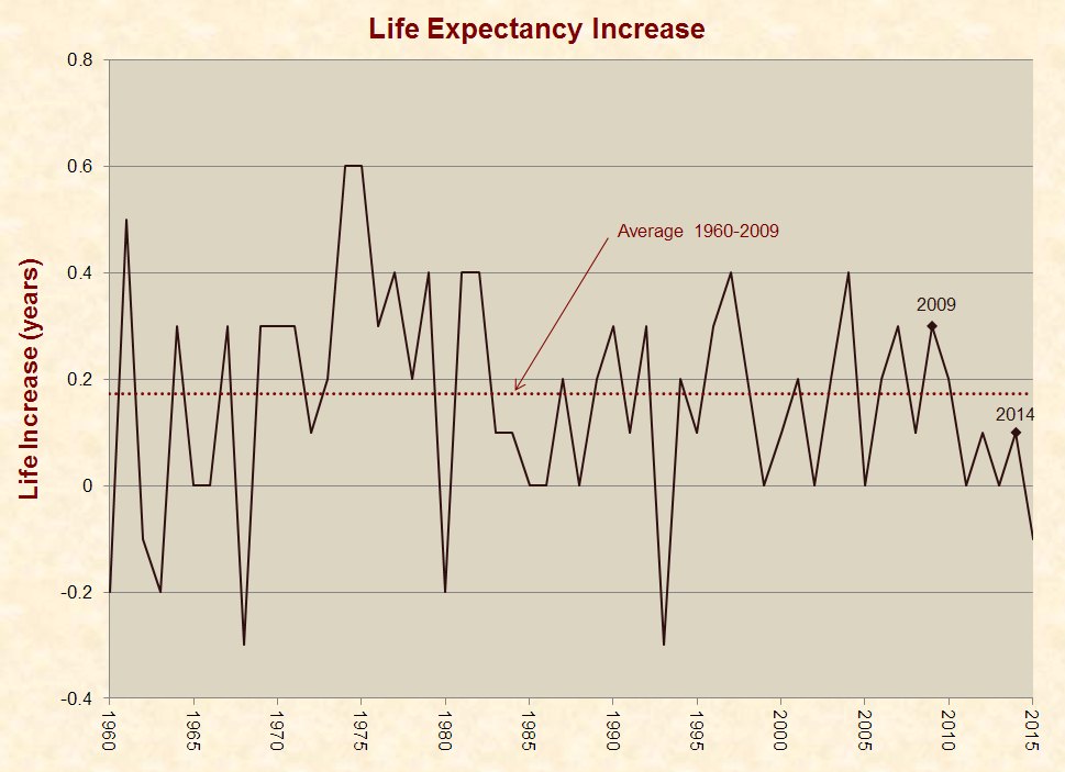
Life Expectancy
From 2010–2015, the average annual life expectancy increase was 0.05 years, as compared to 0.17 years from 1960–2009. The following graph also contains a marker on 2014, because this is when most major provisions of Obamacare became operative, including the Medicaid expansion, rule on preexisting conditions, fine for not having insurance, and the subsidized “marketplace” health insurance plans:
Drug Overdose Deaths
Between 2009 and 2015, the age-adjusted drug overdose death rate increased from 11.9 per 100,000 people to 16.3:

Suicides
Between 2009 and 2015, the age-adjusted suicide rate increased from 11.8 per 100,000 people to 13.3:

Homicides
Between 2009 and 2015, the age-adjusted homicide rate increased from 5.5 per 100,000 people to 5.7:
Sulfur Dioxide
Sulfur dioxide is a common pollutant and highly reactive gas that can cause respiration problems. Between 2009 and 2015, the average sulfur dioxide level in ground-level air declined from 51 parts per billion to 25:

Energy Use & Composition
A particularly misleading aspect of Obama’s farewell address is the following statement, which he led up to by railing against the “selective sorting of the facts” and declaring that “science and reason matter”:
Take the challenge of climate change. In just eight years, we’ve halved our dependence on foreign oil; we’ve doubled our renewable energy; we’ve led the world to an agreement that has the promise to save this planet.
Actually, renewable energy increased by 27% between 2009 and 2015, which is nowhere close to doubling. Obama’s statistic may be rooted in a crafty definition of renewable energy that excludes major sources like hydropower.
Furthermore, Obama’s words leave the distinct impression that the U.S. has cut oil consumption by replacing it with renewables. Yet, U.S. petroleum consumption rose from 6.6 billion barrels in 2009 to 6.7 in 2015.
The primary reason oil imports have fallen is that domestic production has risen due to the use of hydraulic fracturing or fracking, which is unpopular with many environmentalists.
The primary reason oil imports have fallen is that domestic production has risen due to the use of hydraulic fracturing or fracking, which is unpopular with many environmentalists. Per the U.S. Energy Information Administration, fracking has “allowed the United States to increase its oil production faster than at any time in its history,” and it now produces “about half of total U.S. crude oil production.”
Looking objectively at the issue of energy, between 2009 and 2015, U.S. energy consumption rose from 94 quadrillion BTUs to 98. During the same period, consumption of fossil fuels increased from 78 to 79, nuclear stayed level at 9, and renewables increased from 8 to 10:
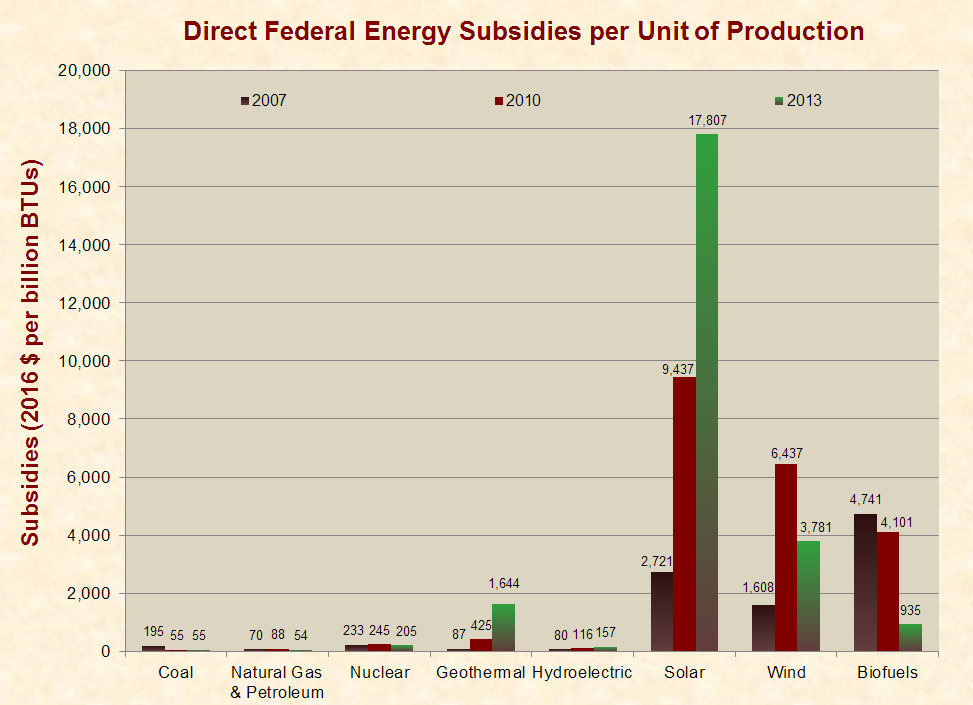
Energy Subsidies
Between 2007 and 2013, inflation-adjusted direct federal energy subsidies per unit of production of solar energy increased from $2,721 per billion BTUs to $17,807. For other energy sources, subsidies varied as follows:
James D. Agresti is the president of Just Facts, a nonprofit institute dedicated to publishing verifiable facts about public policy.